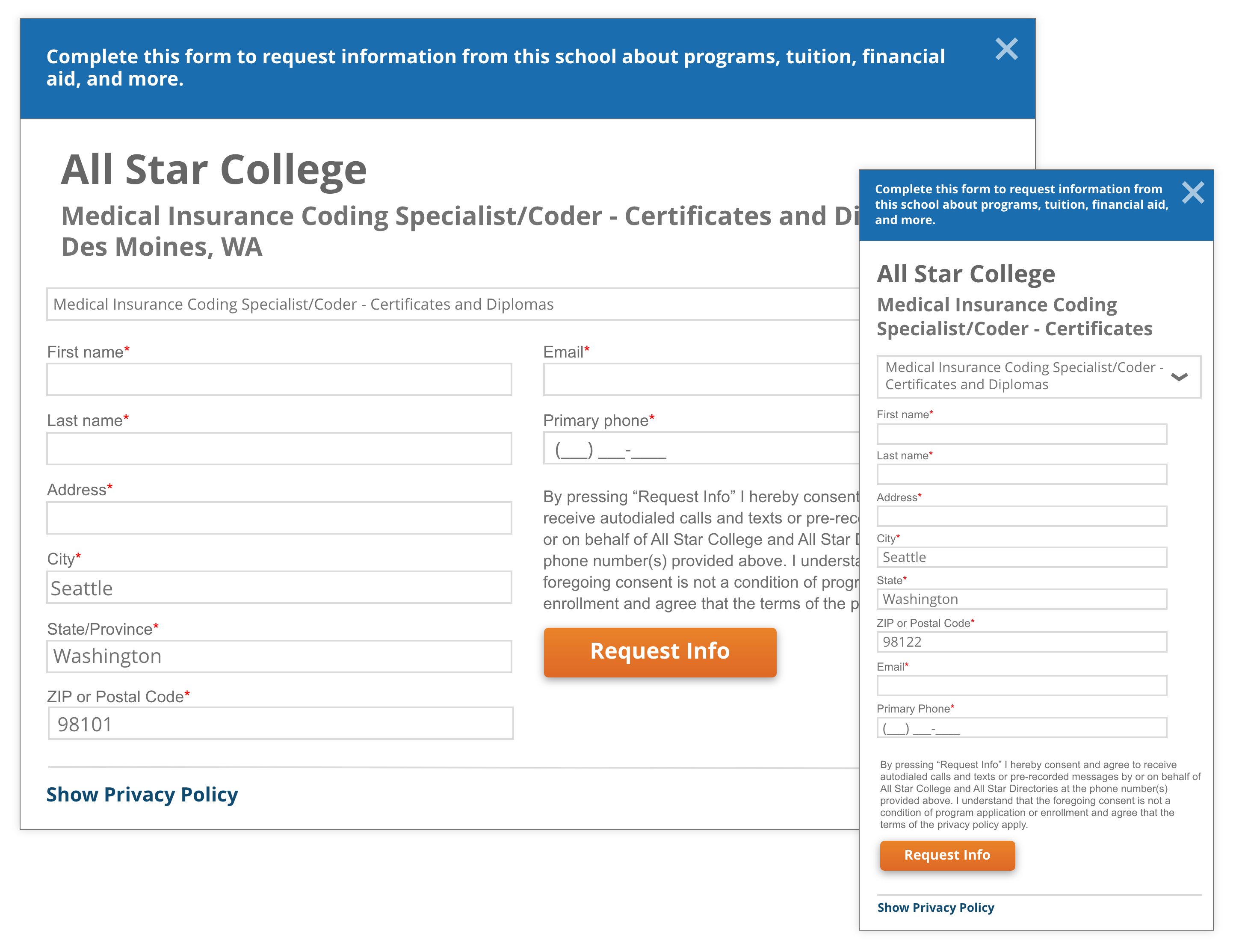
All Star Directories offers non-traditional students the ability to connect with educational institutions. Their legacy Request For Information (RFI) system, used primarily on desktop, had not been updated in over a decade. Despite the growing mobile usage among their target audience, the mobile experience had simply scaled down the desktop version.
Goals
- Redesign and optimize the mobile experience to increase user engagement and conversion
- Streamline the user flow for improved task completion
- Validate the effectiveness of the new design through A/B testing
Challenges
The Legacy Design
The outdated CX wasn’t optimized for mobile, leading to high drop-off rates and decreased conversions. Users were abandoning the process from cognitive overload and poor mobile optimization. End-to-end CX was not meeting the needs of mobile-first users.
Research & Discovery
Comparing User Flows
A review of competitor sites revealed a significant difference in the user flow. Most used a streamlined multi-step process, gathering all necessary information before submitting to schools, while All Star’s system had a more cumbersome single-form submission per school.
This discovery pointed to an opportunity to simplify the process and reduce friction for users.
Competitor Flow

All Star Flow

User Insights
Heatmap & Session Recordings (via Hotjar) showed that users were abandoning the process after scrolling through a long page, likely overwhelmed by the amount of information and poor usability.
Users struggled with small buttons and difficult-to-read text on mobile, leading to frustration and higher abandonment rates.
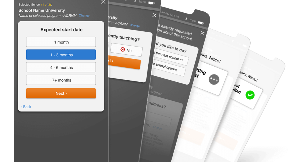
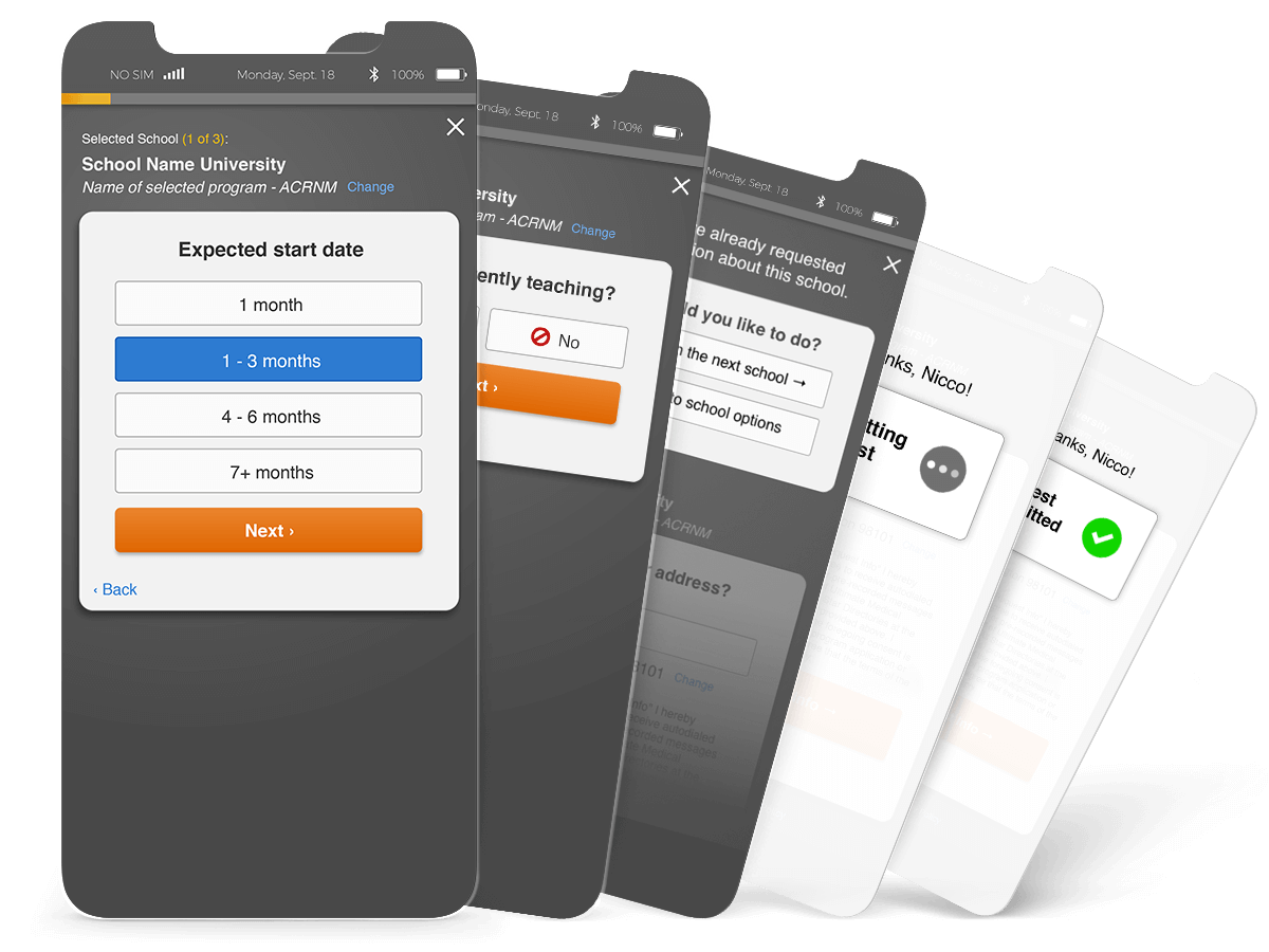
Solution
A Streamlined Wizard Flow
Inspired by our competitors, I introduced a wizard-style flow that broke the form into smaller, more bite-sized steps.The new design focuses on progressive disclosure, guiding users through one question at a time to reduce cognitive overload and make the process more manageable.

Mobile Optimization
I redesigned the interface to be touch-friendly with larger buttons, more readable text, and improved input fields. I added a progress bar to give users a sense of forward movement. Each screen transition was designed with clear feedback to maintain a sense of control for the user.

UI and Interaction Updates
- A Responsive Design ensured that the layout was optimized for both small and large mobile screens
- Clear Conversational Prompts: Text was simplified to help users understand what was needed at each step, making the experience feel more like a guided interaction
- Forward Progress Transitions: Smooth transitions between steps to keep users focused on completing the task.
Results & Impact
A/B Test Success
- A/B testing showed a 7% increase in conversion rates with the new wizard-style flow compared to the legacy design.
- This 7% lift in conversions demonstrated that the new design was both more usable and more effective in driving user action.
Stakeholder Confidence & Next Steps
The success of the redesign and A/B test gave leadership confidence in the team’s ability to deliver impactful solutions.
As a result, we were able to secure approval for further updates to the broader RFI experience, including improvements to the school listings and pre-filtering processes.