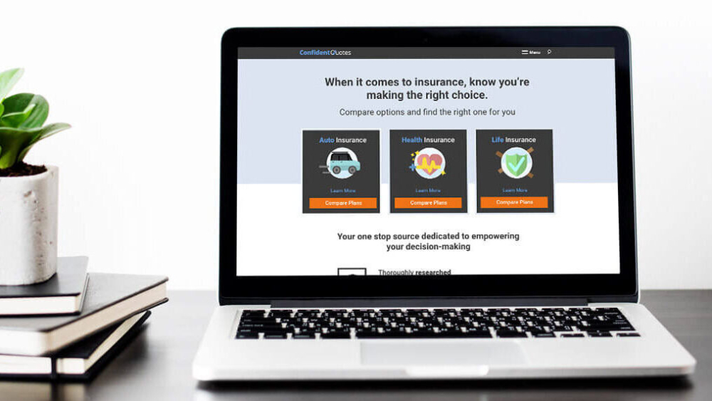
Confident Quotes was the first product launched by All Star, an education marketing company, in the insurance space. The goal was to create an MVP that would drive paid search traffic and establish a solid foundation for future organic growth. With limited access to direct user research, I focused on market and competitor research, building a user-centered design strategy that would align with the needs of insurance shoppers while reflecting the brand’s identity of trust and reliability.
Business Goal
Develop a proof of concept for the new insurance platform, focusing on attracting users through paid search.
Design Goal
Create a user-friendly, engaging website with a strong brand presence that encourages trust while addressing the unique needs of insurance shoppers.
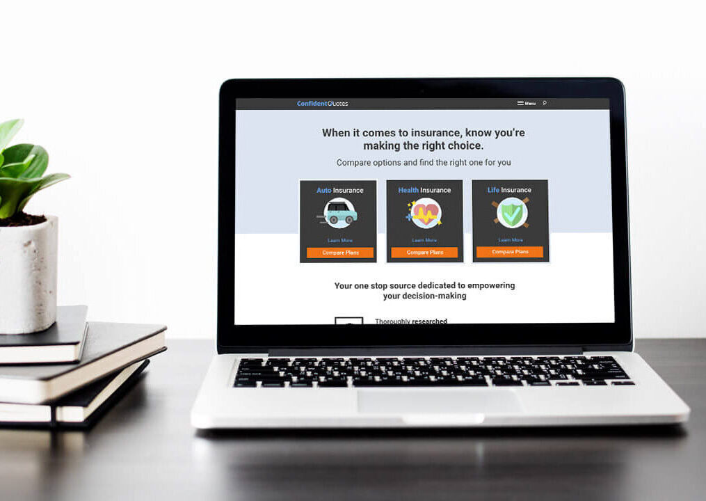
Process and Approach
Product & User Research: Learning About Insurance
Given that this was a new space for All Star, I started by diving into existing studies and competitor websites. The biggest insight was that the insurance buying journey is incredibly short, typically only 7 days from awareness to purchase. This contrasted with All Star’s traditional customer base, which had a much longer decision-making cycle.
These are a few of the pages from the research document I created:
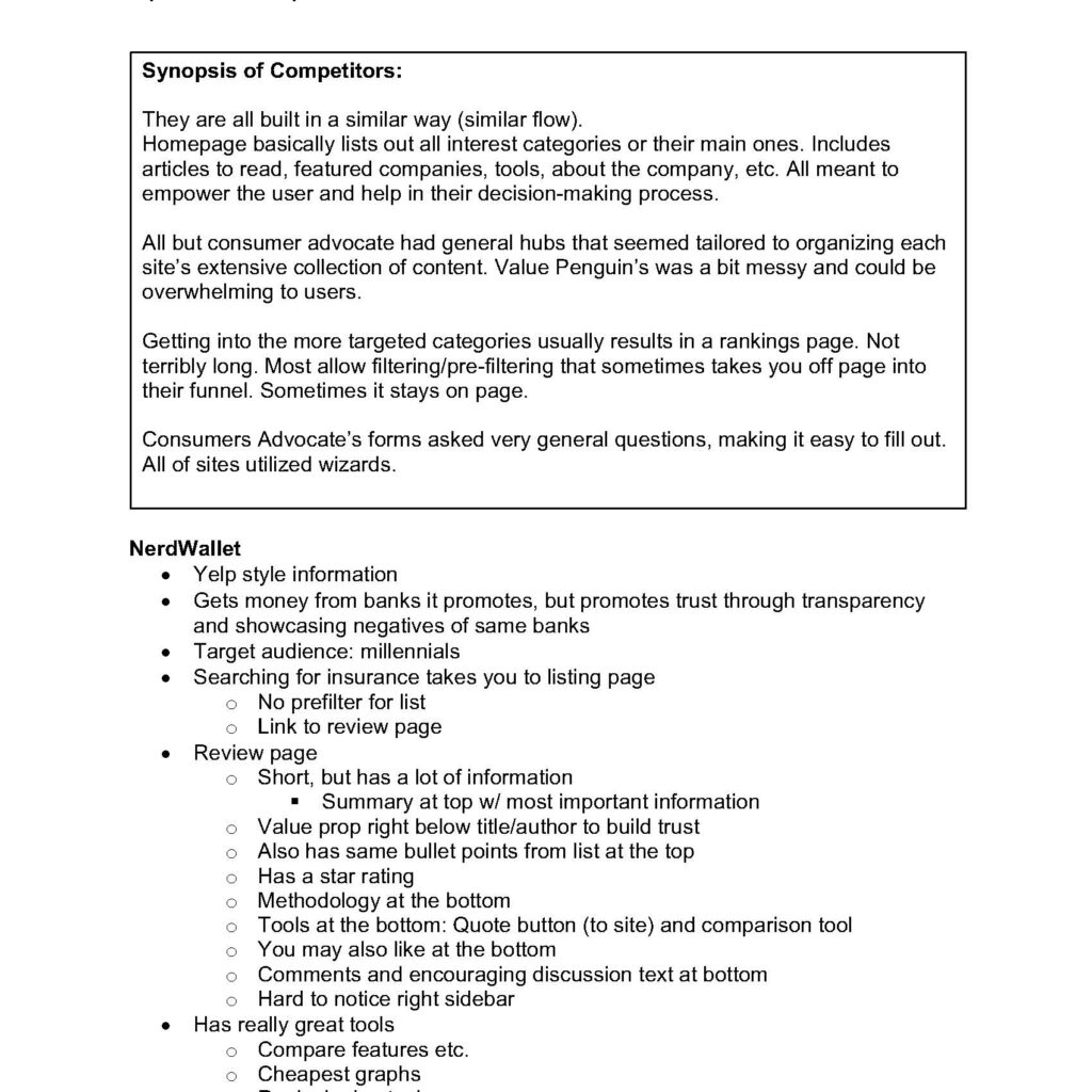
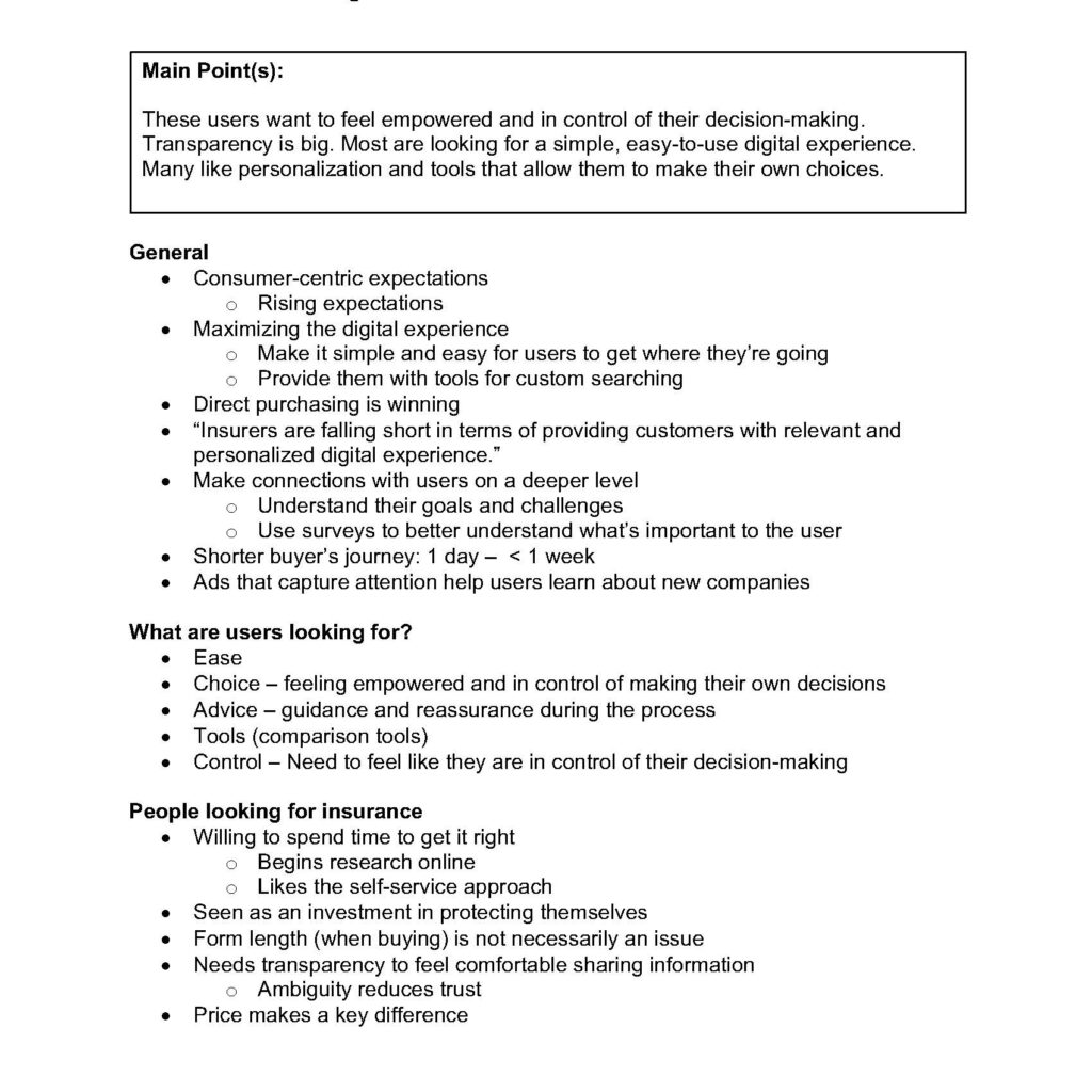
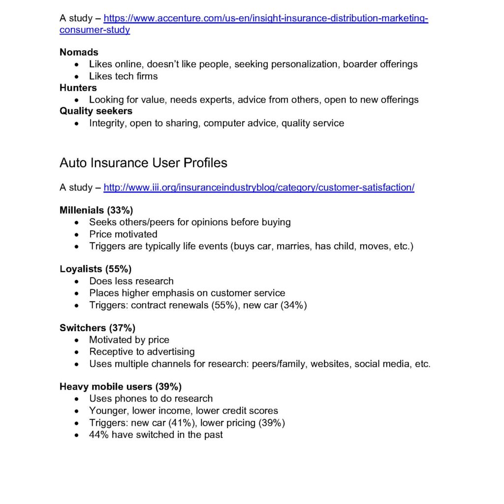
I presented my findings to the team, highlighting the key differences in the buyer’s journey for insurance shoppers and setting the foundation for the website’s design.
Personas & User Journeys
Defining Our Audience
I led a persona workshop with stakeholders to define our target audience. We identified three key personas, each with distinct needs and pain points. Patterns emerged and we ended up creating three personas:
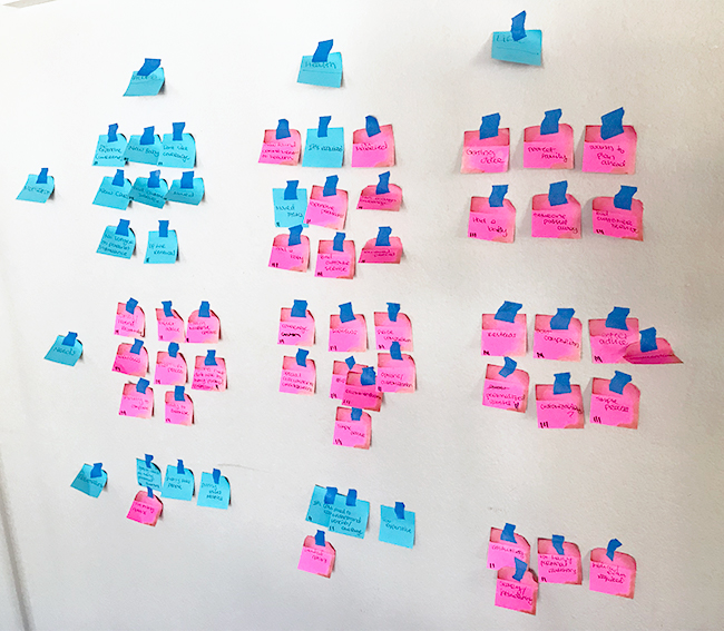
Circumstance Changer
Individuals seeking insurance due to a significant life event (e.g., marriage, moving, buying a car). They need tools to compare and customize plans and prefer a simplified process.
Need
- Find insurance to fit new circumstance
- Tools to compare and customize plans
- Cost minded
- May seek out recommendations
Pain Points
- Too many or too little options
- Quotes that ask too many personal questions
- Complicated processes
Company Switcher
Shoppers looking for a better policy during open enrollment or when their term ends. Price is a driving factor, and they prioritize easy comparisons and reviews.
Need
- Tools to compare policies
- Sorting by price
- Customizable quotes
- Recommendations/reviews
Pain Points
- Processes that take too long
- Unable to find a plan that meets financial and coverage needs
Quality Seeker
Customers unhappy with their current provider, seeking better coverage or customer service. They value reviews and detailed coverage information.
Need
- Reviews/ratings
- Recommendations
- Testimonials
- Detailed coverage information
Pain Points
- Difficult quote process
- Finding coverage for specific situations
- Lack of reviews/social proof
User journeys
I also created user journey for each persona, illustrating their accelerated decision-making process, which helped inform the website’s user flow.
Circumstance Changer
Company Switcher
Quality Seeker
Information Architecture & UI Design
Structuring the Experience
With a solid understanding of user needs, I mapped out the website’s structure and designed the wireframes for the key pages, ensuring that the user flow was intuitive and aligned with the fast-paced buyer journey.
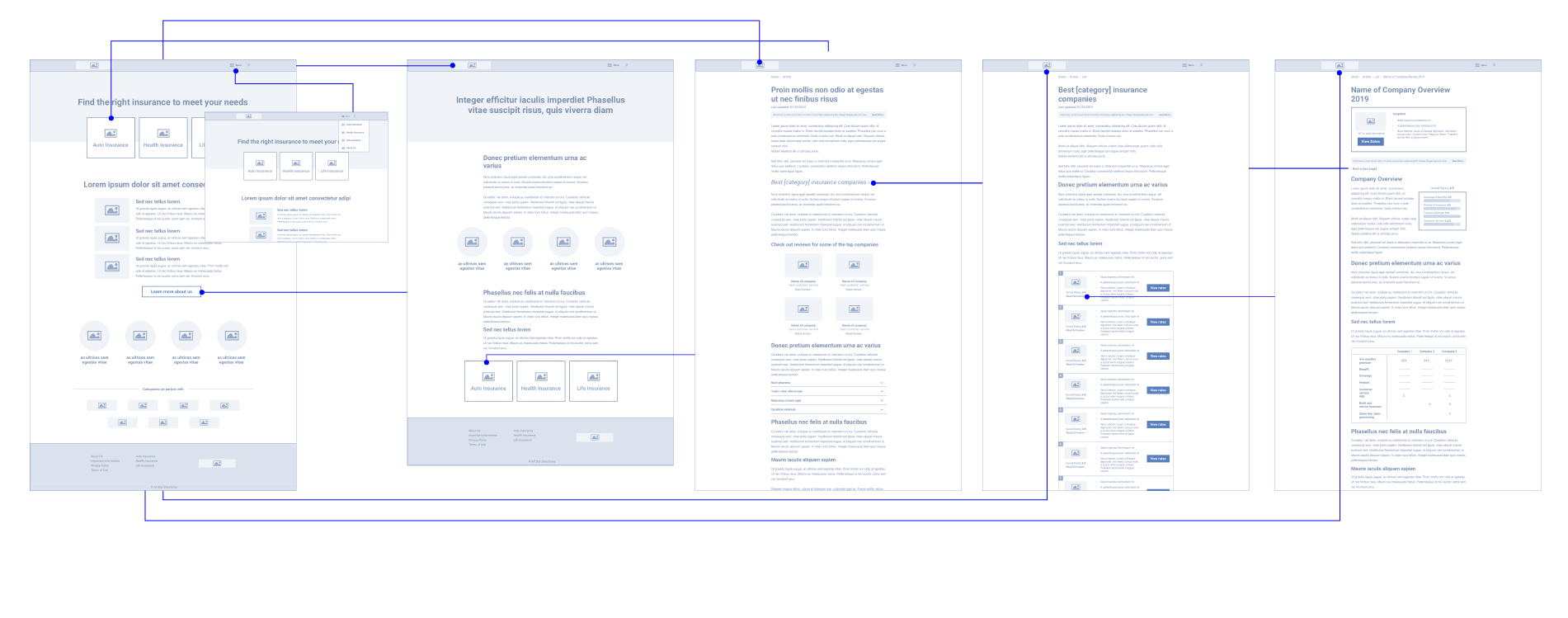
Branding and Visual Design
Trust with a Playful Twist
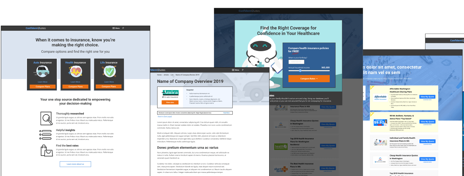
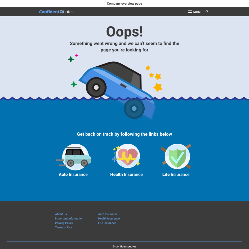
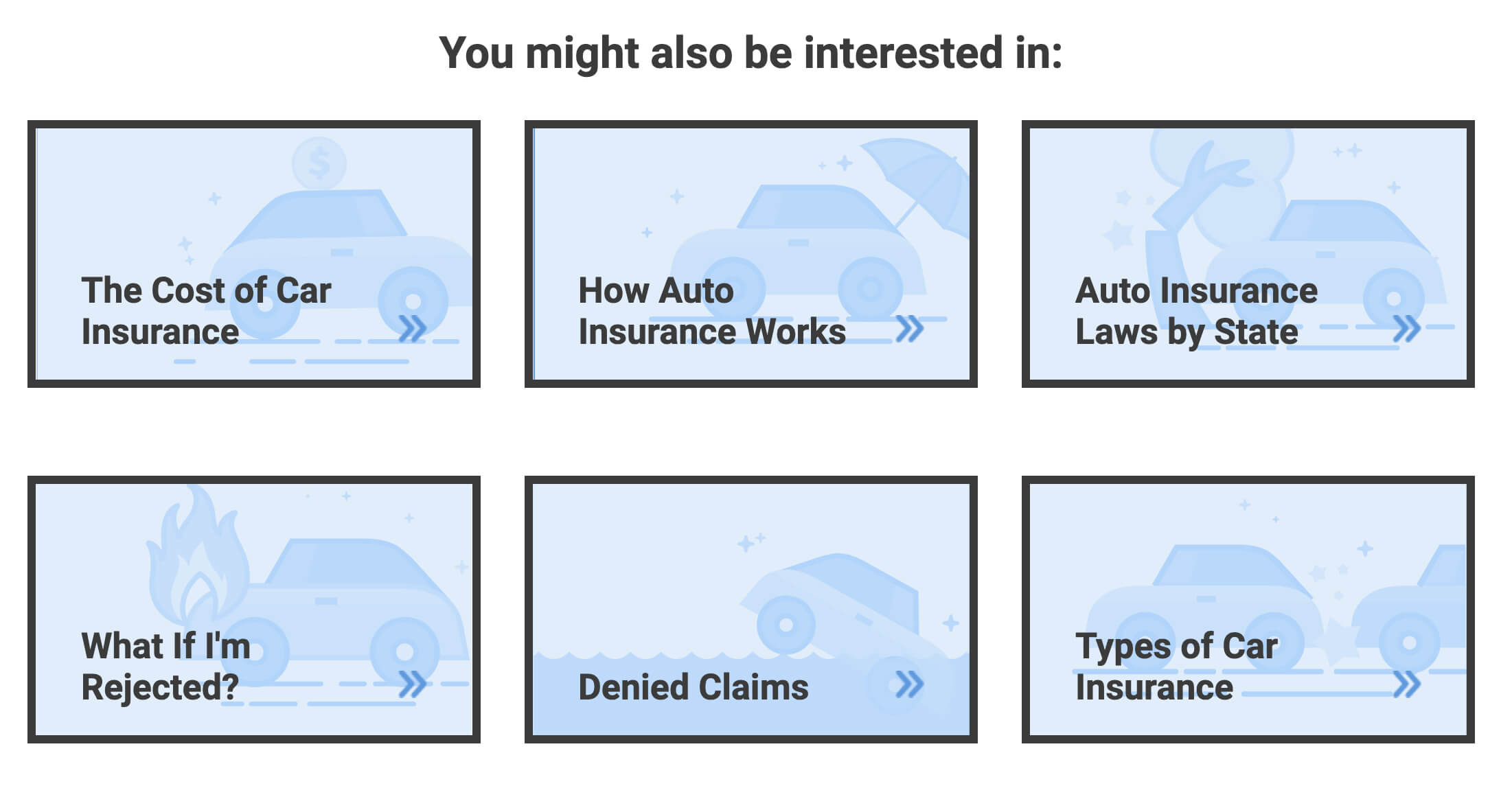
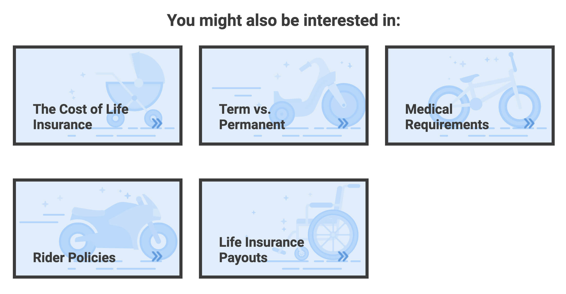
For the branding, I designed a logo that conveyed trust and confidence, using shades of blue to evoke a sense of security. The overall visual identity kept a professional tone but incorporated playful elements through iconography and imagery, ensuring the website stood out in a traditionally serious space like insurance.
Building Trust Through Design
The key design challenge was balancing trust and professionalism with a fresh, engaging approach. I carefully selected typography, color schemes, and imagery to create a calming and authoritative feel while keeping the user experience light-hearted and approachable.
Results and Impact
Reflection
The MVP website was successfully launched, driving paid search traffic and establishing a strong foundation for future growth. By integrating user research from the beginning and addressing the key pain points of insurance shoppers, the design helped create a seamless, user-friendly experience that aligns with both business goals and user needs. The branding and visual identity positioned Confident Quotes as a trustworthy yet approachable player in the competitive insurance market.
This project demonstrated how strategic UX/UI design can drive business objectives while building a solid platform for ongoing optimization and brand expansion. Moving forward, the insights and design framework established in this project will serve as a foundation for future product development and user experience improvements.
