This project was a redesign of an existing feature within the Operational Readiness Review (ORR) tool. The original report, a basic table, only provided information about whether individuals in an organization had completed or had overdue reviews. The goal of this redesign was to enhance its functionality by adding deeper insights and helping users track trends, risks, and progress, ultimately improving decision-making and operational efficiency.
Goals
The primary challenge was the existing feature lacked actionable insights and flexibility. Users needed a tool that would allow them to:
- Quickly identify key issues: such as overdue reviews, high-priority risks, and past-due action items.
- Spot trends and patterns: enabling users to track progress, identify hot spots, and proactively manage risks.
- Generate customized reports: empowering users to filter data by multiple parameters, create tailored views, and share or download reports for collaboration with stakeholders.

By addressing these needs, the redesigned feature aimed to provide a more user-friendly, efficient, and insightful tool that would improve overall operational readiness and decision-making for users and stakeholders.
Process and Methodology
Gathering Requirements
The initial challenge was working in ambiguity without a dedicated product manager or formal documentation. To understand the needs and expectations for this feature, I collaborated closely with the Technical Project Manager (TPM), Development Manager, and the Principal Designer for the organization.
We had several discovery sessions to align on the feature’s purpose, define use cases, and clarify technical constraints. I also sent out a survey to gather direct input from stakeholders on what data points and features would provide the most value with results being:
- Need to prioritize overdue reviews and high-risk action items
- Demand for trend tracking in review progress and risks
- Need for customizable reports
- Easy data sharing for better collaboration
- Issues with unclear terminology and usability

Survey data
These insights shaped the initial flows, ensuring it addressed user needs and improved functionality.
Flows
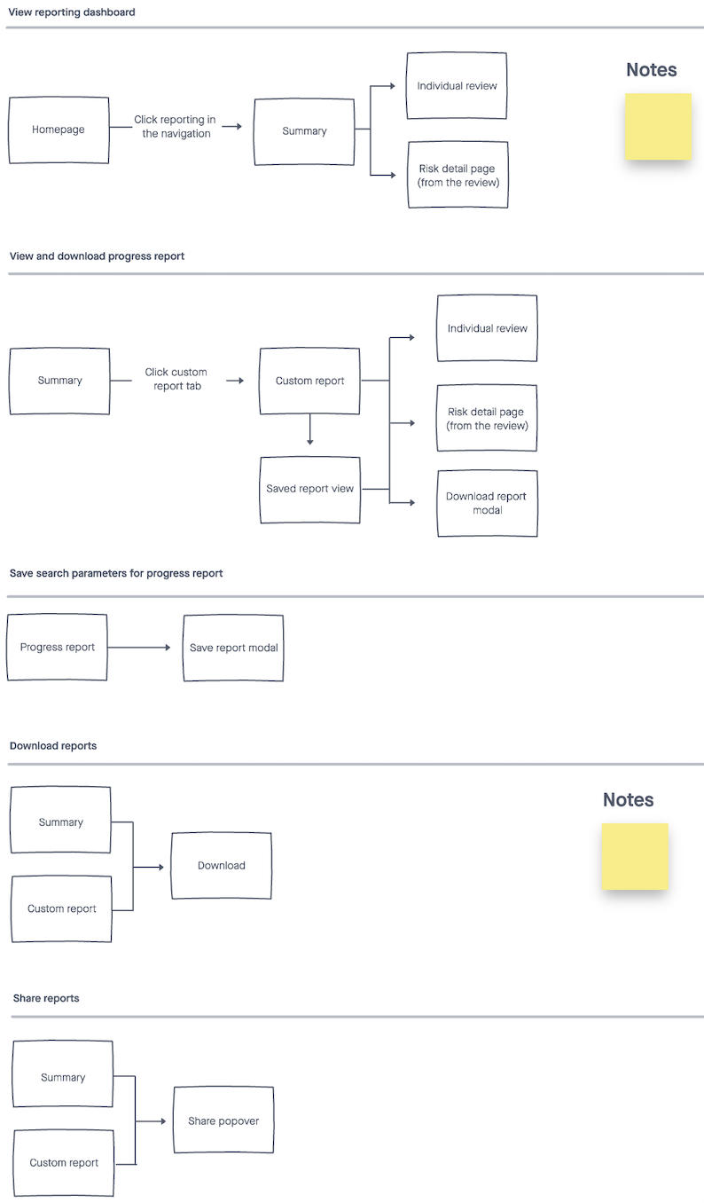
Then I worked with the team to define the content architecture for the primary screens.
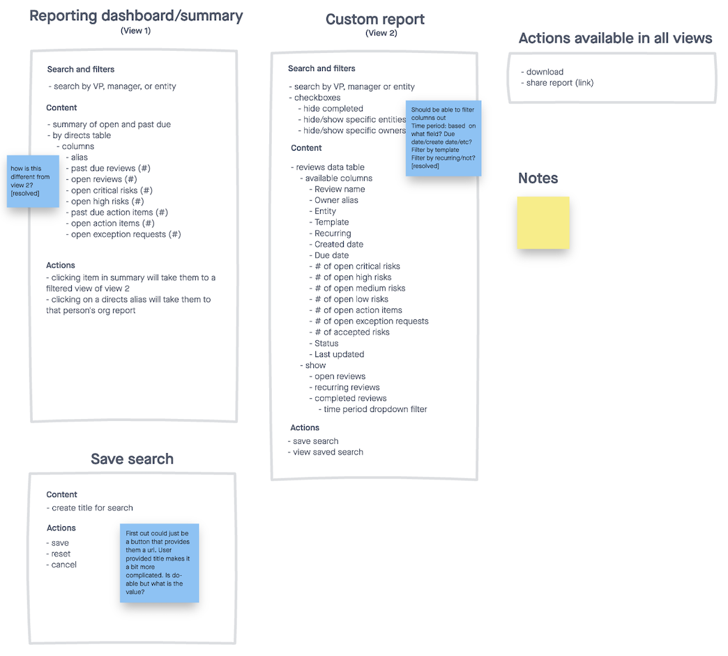
Design Iteration
Mocks
Once the basic flows and content structure were signed off, I moved on to creating the mocks.
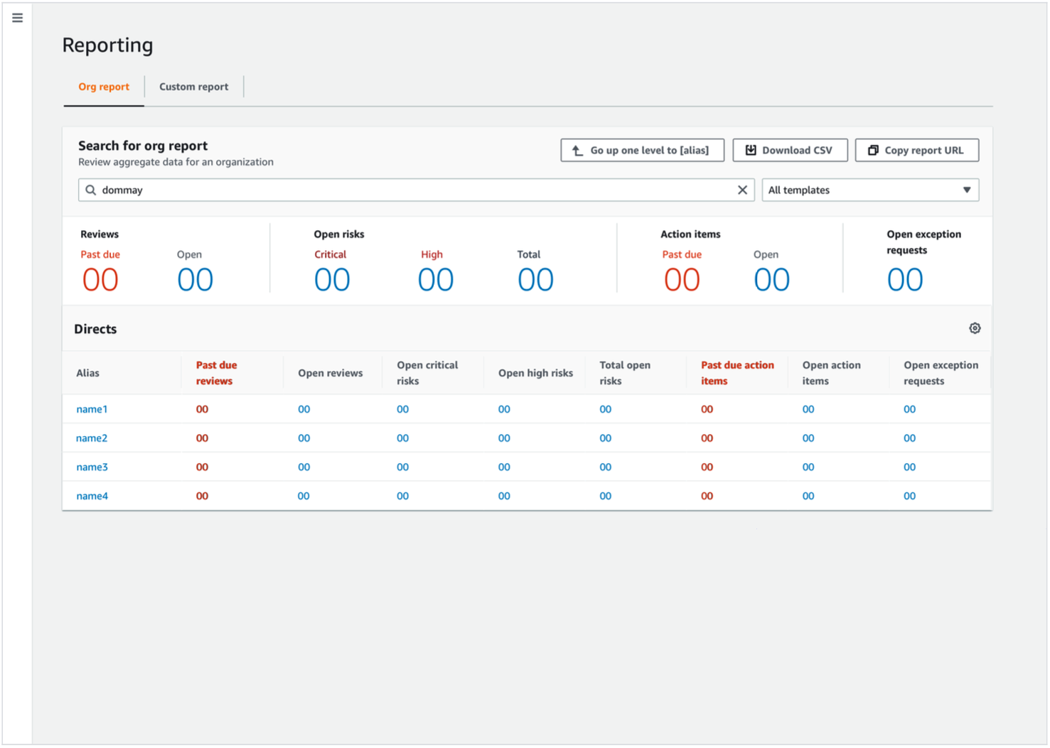
For the main dashboard, I focused on ensuring users could quickly identify critical information. This way, users could immediately see what needed attention without sifting through unnecessary data.
Custom Report
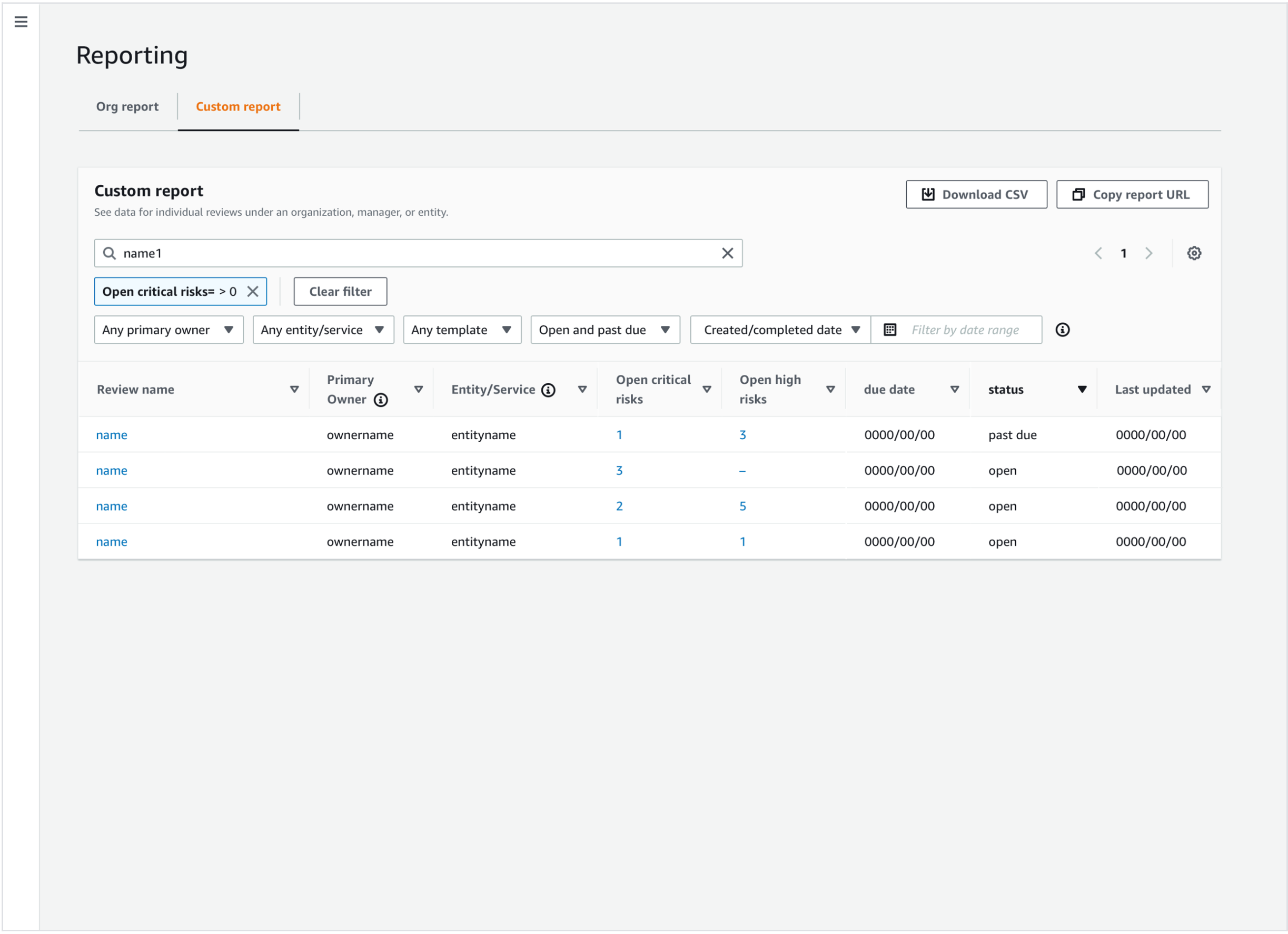
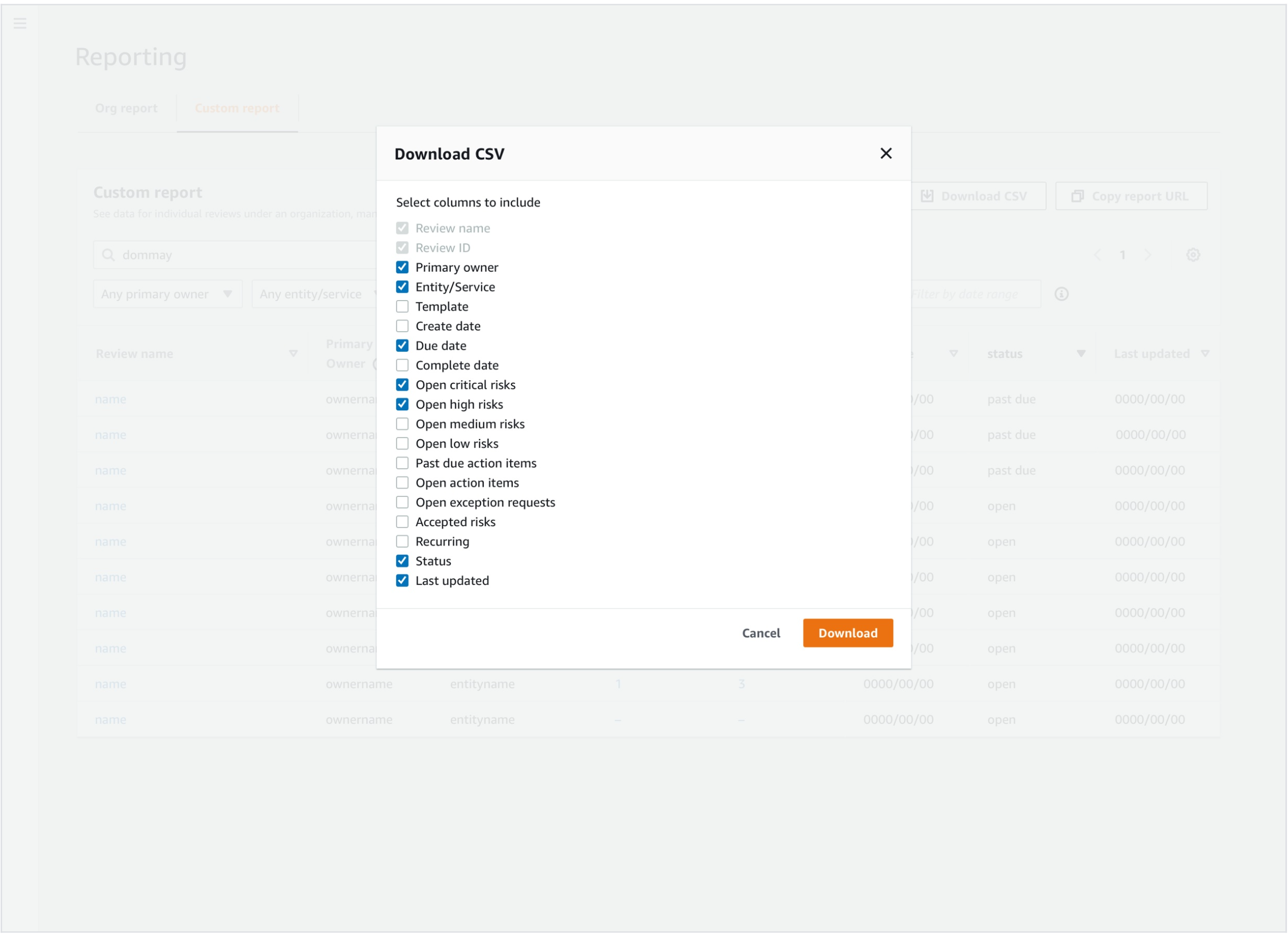
A key feature in the redesign was the Custom Report functionality which allowed users to filter results by multiple parameters, such as review status, risk severity, date range, and ownership. You could also download reports in CSV or PDF formats and share links with stakeholders for easy collaboration.
The custom report functionality was crucial for users who needed to share insights or track trends across different organizations.
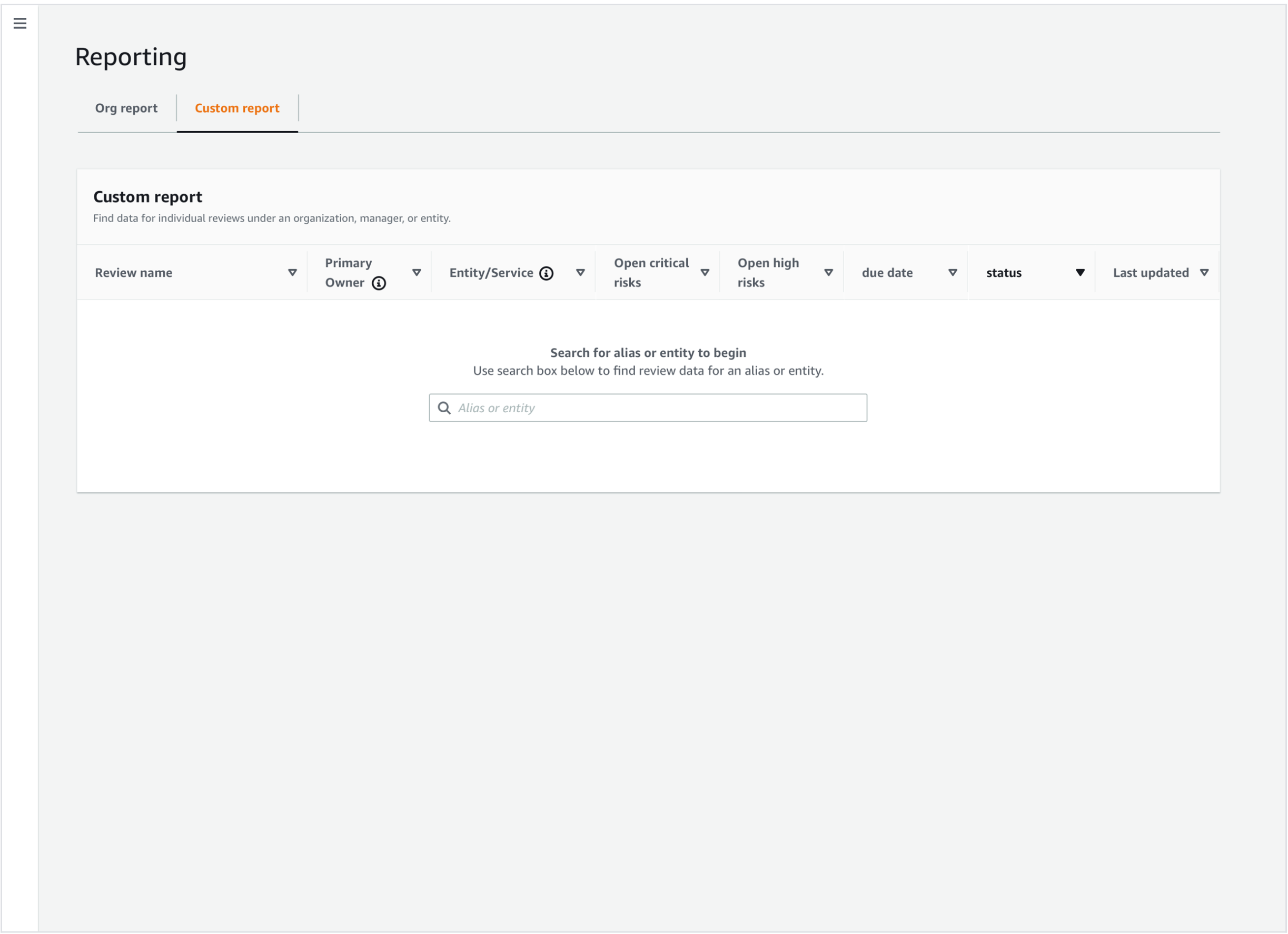
Customers would input a user’s alias into the search box which would show all the reviews owned by the teams in their organization.
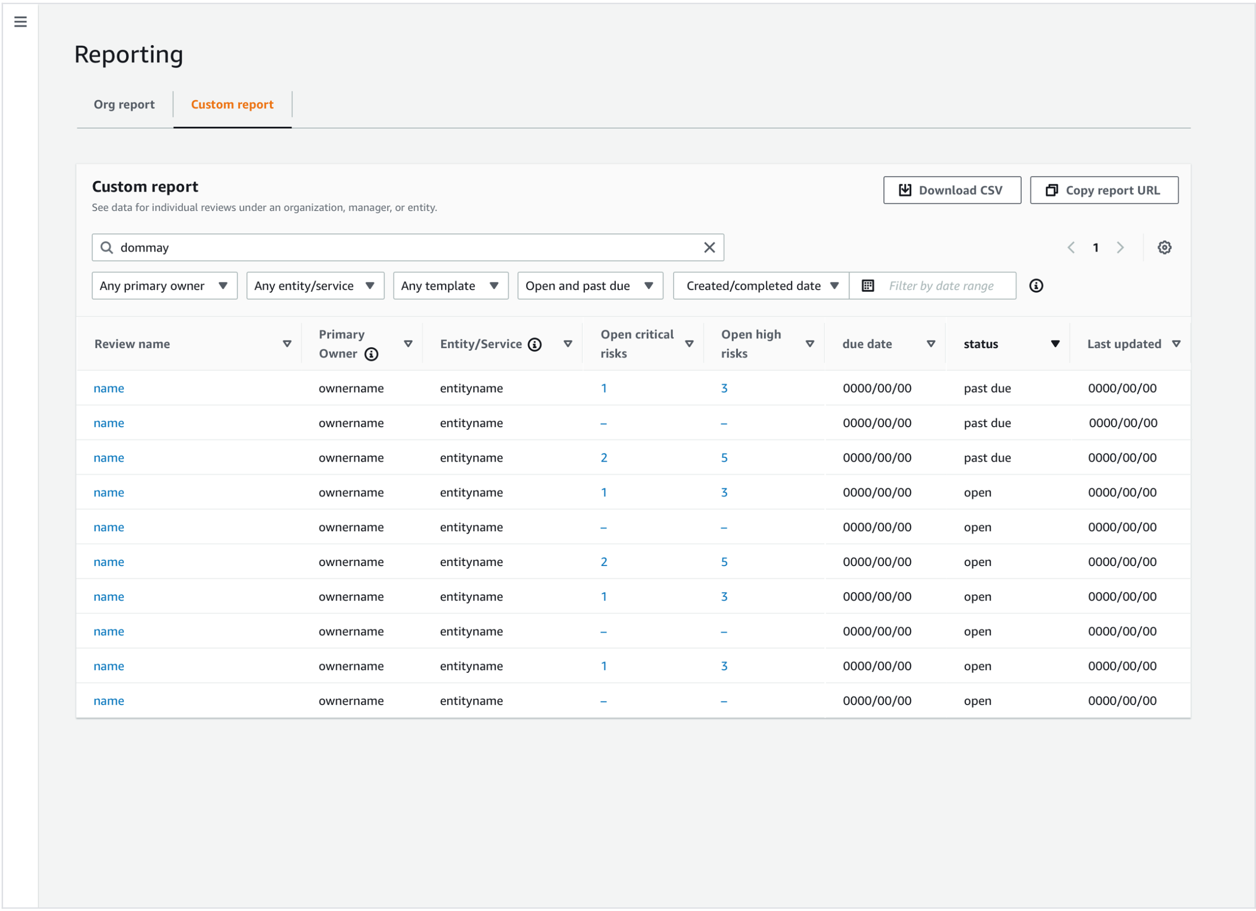
And filter the results with the various parameters.
We provided options for downloading the report as well.
Usability Testing
Validating the Design
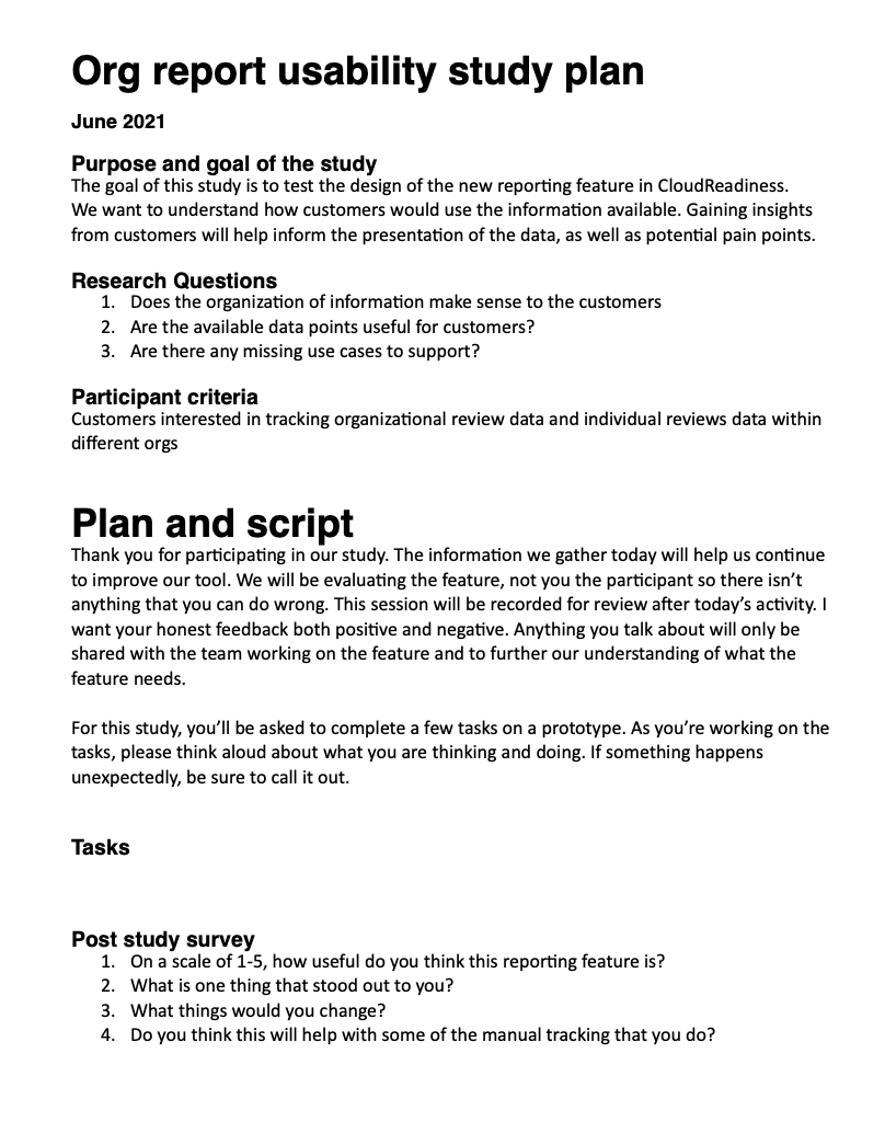
Once the design was ready, I ran a usability test with 6 participants using UserTesting to validate the design. The primary research questions were:
- Are there any missing use cases?
- Does the organization of information make sense?
- Are the available data points useful for customers?
Study Results
The key findings included:
- Unclear terminology (e.g., “risk action”) led to confusion around key features, suggesting the need for clearer language.
- The report-sharing functionality was not intuitive, with users unsure how to share reports effectively. This pointed to a need for a more straightforward sharing process.
- Users had concerns about permissions and access when downloading or sharing reports, highlighting the need for a more transparent and user-friendly permissions system.
As a result, we prioritized refining the language, simplifying the sharing interface, and improving the permissions system for better control and clarity.
Results
An Improved User Experience
The redesigned Operational Readiness Report tool not only improved user satisfaction but also enabled teams to make quicker, more informed decisions. By focusing on user needs, iterating based on feedback, and delivering key features like customizable reports and actionable insights, the updated tool provided significant operational value.