
Fixing 5 Years of Drop-Off: Mobile Optimization for a High Stakes RFI Flow
All Star Directories offers non-traditional students the ability to connect with educational institutions through their legacy Request for Information (RFI) system. It was a desktop experience that had not been successfully updated in over a decade and conversion was waning.
Highlights: Wizard design and mobile optimization strategy focused on meeting customers where they were led to successfully conversion.
Business Goal
Redesign the legacy experience to increase user engagement and conversion
UX/UI Design • Mobile Optimization • Interaction Design
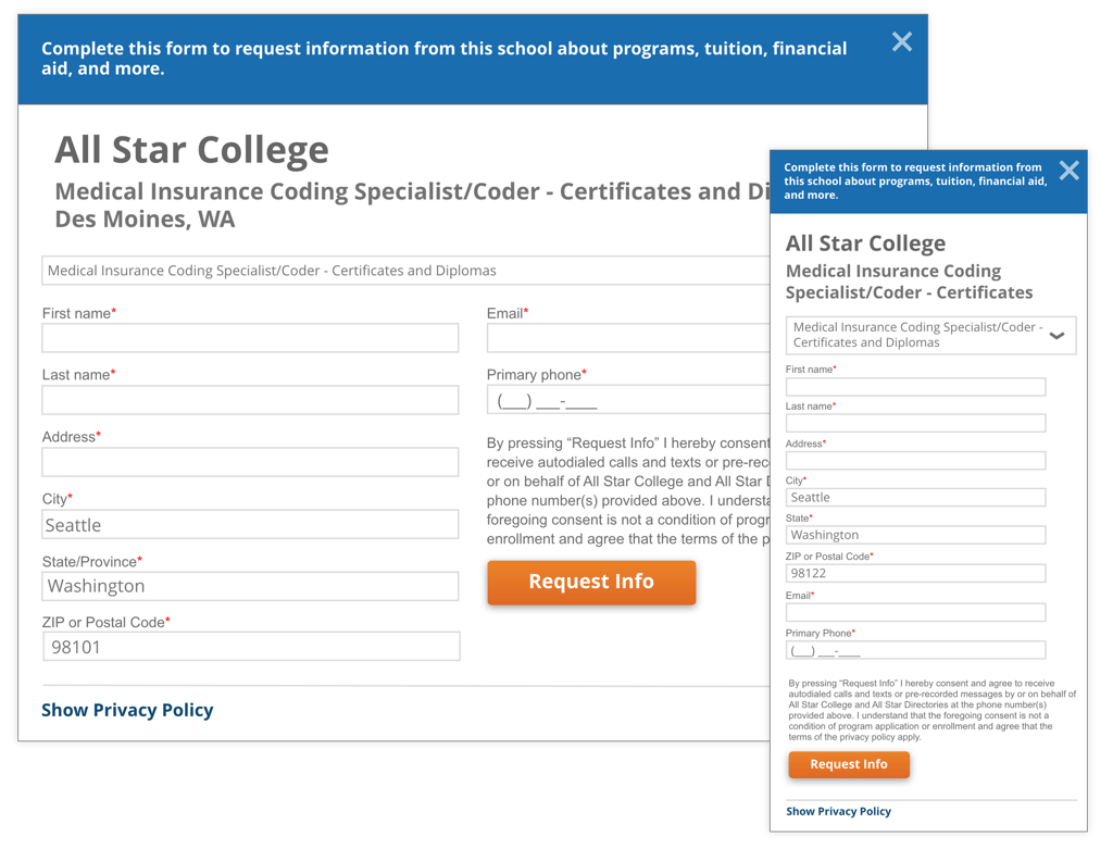
The Legacy Design: Critique and Competitive Review
2-column design adding to customer cognitive load when filling out
Small form fields making it hard to read
Small text was hard to read
Repetitive information creating hierarchy problems
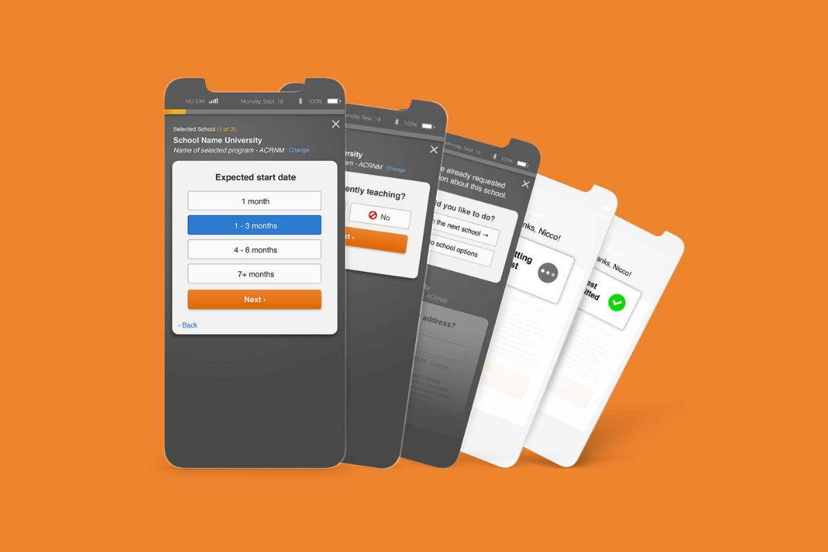
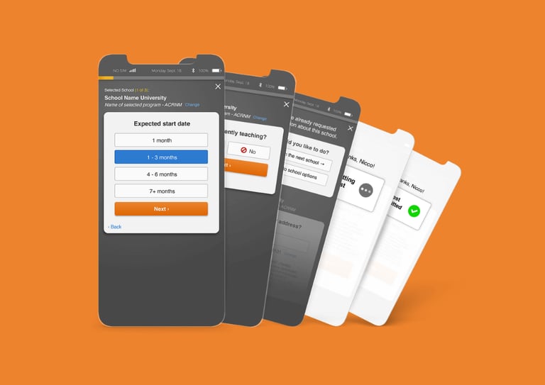
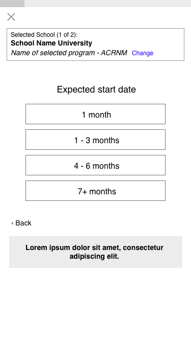
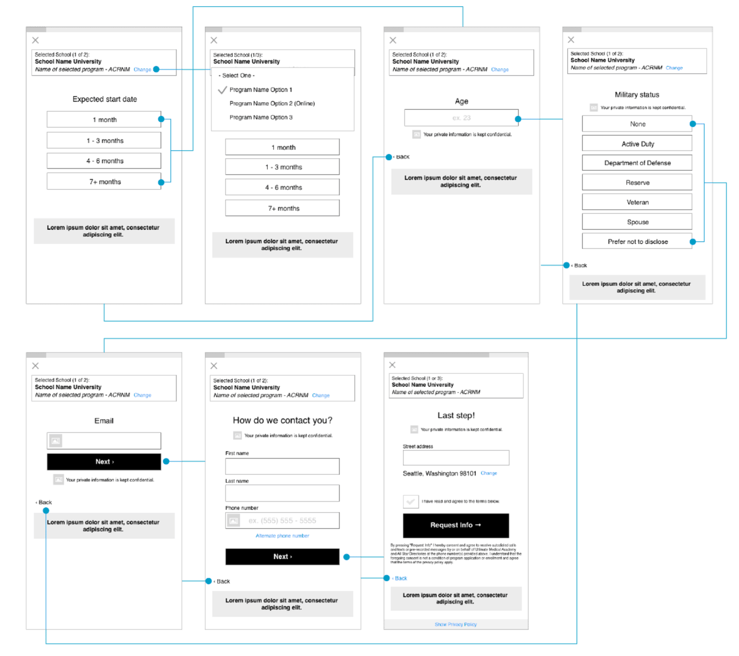
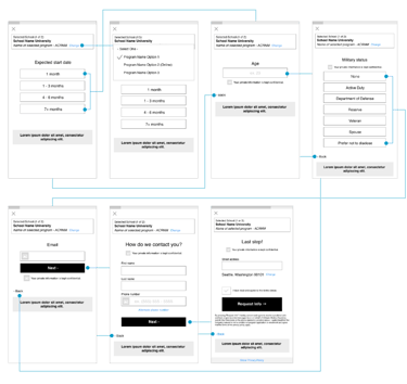
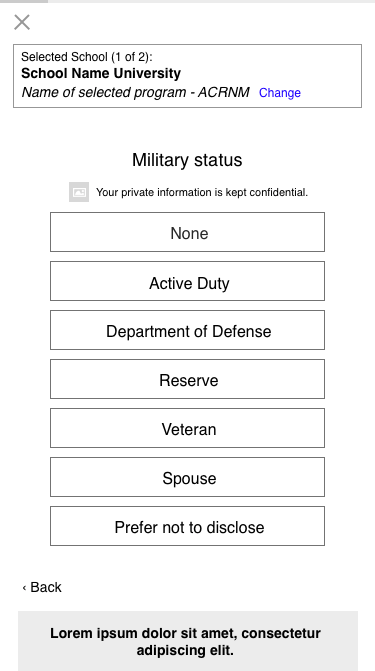
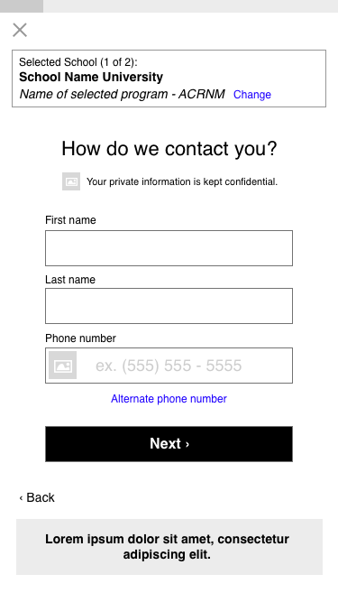
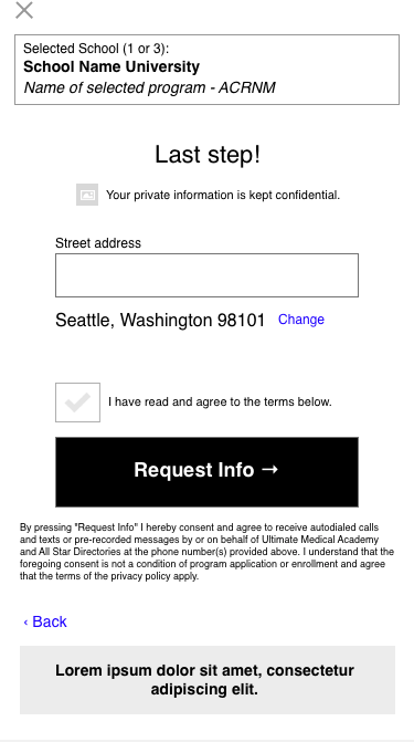
Solution: A Streamlined Wizard Flow
To better understand how our competitors were engaging with customers, I did a review of their experience and mapped out the user flows in comparison to All Star's flow.
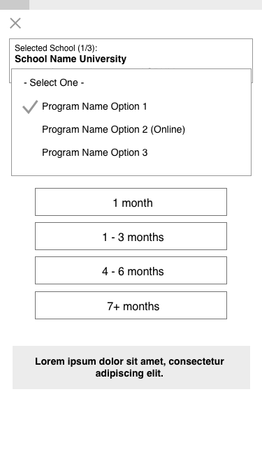
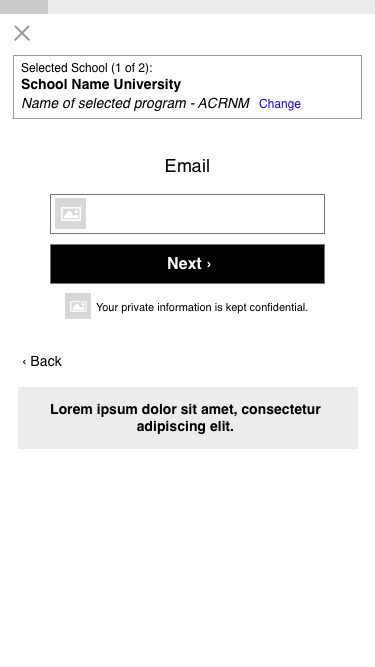
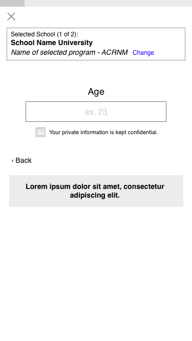
A responsive design ensuring the layout was optimized for screens of all sizes.
Clear, Conversational prompts: Text was simplified to help customers understand what was needed at each step of the journey, making the experience feel more guided.
Forward Progress Transitions: Smooth transitions between steps to keep users focused on completing the task.
Results and Impact
The Updated Experience
This experience was launched in an A/B test against the legacy experience with the new experience outperforming the legacy with a 7% increase in conversion.
My design was the first successful change made to the legacy experience in over 10 years bringing leadership confidence in the value of data-driven design and in the team's ability to deliver impactful solutions. This led to more leeway to update other parts of the experience that were also underperforming in its legacy state.
Design Goal
Streamline user flow for improved task completion
Mobile optimization strategy
Desktop Critique
Mobile Critique
1-column design
Some forms had a lot of fields, discouraging customers from completion
Small form fields were not touch-friendly
Small text was hard to read
Repetitive information creating hierarchy problems
Experience Critique
I did a visual review of the experience and had new employees walk through the experience as a make shift usability test.
Here are the findings:
Single form submission for every school. A new form was shown to the customer after each submission.
Inspired by our competition and based on the research I did, I introduced a wizard-style flow that broke the form into smaller, more bite-sized steps. The new design focused on progressive disclosure, guiding customers through one question at a time to reduce cognitive overload and make the process more manageable.
Used a streamlined, multi-step process, gathering all necessary information from customers before submitting to schools.
All Star Original Flow
Competitor Flow

Comparing User Flows
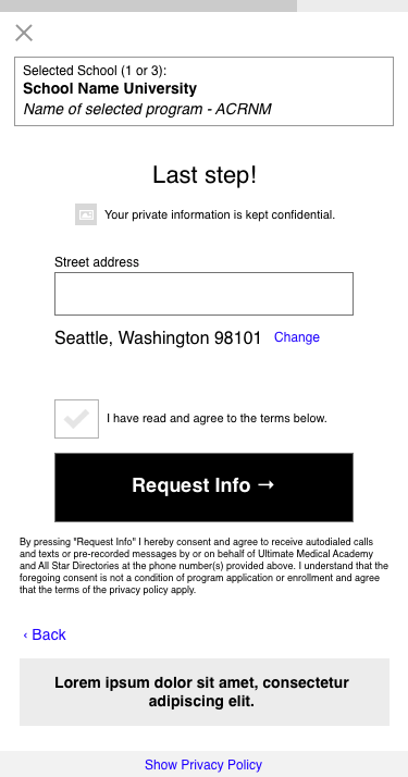
I also redesigned the UI to focus on the mobile experience.
Large-touch friendly buttons and form fields
Large easy to read-text
Progress bar to let customers know where they were in the process
Transition screens in between school forms to provide clear feedback of task completion
Mobile Optimization
Continuous treadmill experience had customers sending suggested RFIs without realizing it
Abandonment happened on long forms


Turn Ideas into Results
Whether you’re launching something new, improving an existing experience, or trying to turn more visitors into customers, I help design solutions that drive clarity, trust, and results.
Let’s connect.